Key Elements Of Responsive Web Design In 2026
In today’s digital driven era, people browse websites from multiple devices, such as laptops, mobile phones and desktops. They expect websites to load fast and look visually aligned, ensuring a seamless user experience. This change in user navigation trends encourages businesses to design websites that deliver a great UX across different screen sizes and devices. That’s where a responsive web design comes in.
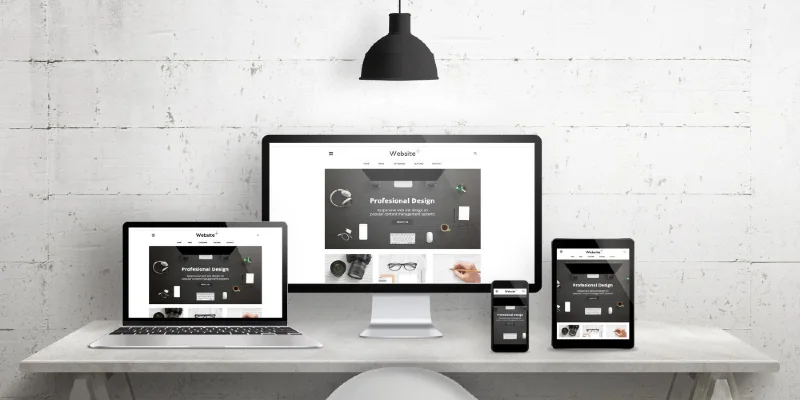
Responsive design is the need of the hour in the web designing and development industry. A responsive website fits perfectly on any device, offering a consistent layout, seamless navigation and well structured content.
In this guide, we’ll break down the core elements of responsive web design that matter the most in 2026. A website that enhances user experience and increases engagement can benefit SEO efforts while improving its overall performance. Make sure you consider the most reliable web designing Gold Coast services for a responsive and adaptive website.
Let’s Get Started!
1. What is a Responsive Web Design?
In simple terms, responsive design is a flexible approach to website layout that adapts to different device sizes and types. Responsive web design removes unnecessary distractions when accessing non optimised web pages. No more zooming to read web page content or horizontal scrolling when moving between devices. Everything adapts automatically to the screen size, enhancing the user experience.
For instance, a user uses a mouse when accessing a website on a desktop, a trackpad on a laptop and a touchscreen on a mobile phone. So, a web designer’s goal is to fix core web vitals and provide a seamless experience across all devices.
Here are the key elements of responsive web design that make a world of difference:
2. Fluid Grid Layouts

A fluid grid layout is a key component of responsive web design. It uses percentages rather than fixed pixel measurements, allowing website elements to resize proportionally with screen size. In simple terms, content blocks, columns and sections adjust automatically, ensuring proper alignment, structure and spacing.
This component develops an adaptable design structure, giving a seamless user experience regardless of any screen size or device. It also enhances flexibility, making it easy to update web page content or add new banners without affecting the web design or the site’s visual elements.
3. Responsive Typography
The right use of fonts, text arrangements and space can enhance the visual appearance and readability of a website. It is known as typography in web designing Gold Coast. This technique creates a readable and eye catching text for users, boosting the user experience.
In responsive typography, font sizes, spacing, and line height automatically adjust to screen dimensions. Users can comfortably read the site’s content across devices, such as desktops, laptops, and smartphones.
Responsive typography focuses on creating a cleaner visual hierarchy of headings, subheadings, images, and body text to enhance the readability and overall structure of your website.
4. Flexible Media and Images
Imagine! You load a website on your smartphone, and there is full width banner image overflowing the viewport. This does not lead to frustration but also distracts users. That’s where the flexible media and images component comes in. This is one of the critical aspects of responsive web design that can:
- Scale up and down images and other media depending on screen sizes.
- Prevent overflow or distortion of media.
- Keep visuals aligned and clear across devices.
- Optimise loading speed by automatically resizing images for different screen resolutions
5. Mobile First Design
The mobile first design approach focuses on designing a website first for smaller screens like mobile phones, and then expanding the layout for laptops and desktops. This ensures more structured, aligned and efficient content and visual elements across devices.
There is no denying that mobile first design can do wonders for improving a website’s loading speed and SEO performance, driving organic traffic for consistent sales. By incorporating mobile first element, you will make your site ready for the future because mobile users are the game changers in the industry.
6. CSS Media Queries
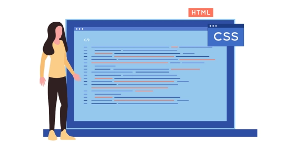
CSS media queries are the core aspect of responsive web design. It allows you to apply different styles based on the characteristics of a device, such as screen width, resolution and height.
Developers can easily define specific breakpoints that adjust the layout for smartphones, desktops, and laptops.
Web designing Gold Coast experts can use CSS media queries to rearrange content, hide certain elements and adjust font size based on the device being used. This high level of customisation optimises site for all devices, enhancing the user experience.
Wrapping Up
Responsive web design is no longer an option in the web designing and development industry. It keeps your website relevant, scalable and adaptable across devices. The elements mentioned above in this guide work together to improve user experience, boost readability, improve site loading speed and overall performance for long term business growth.